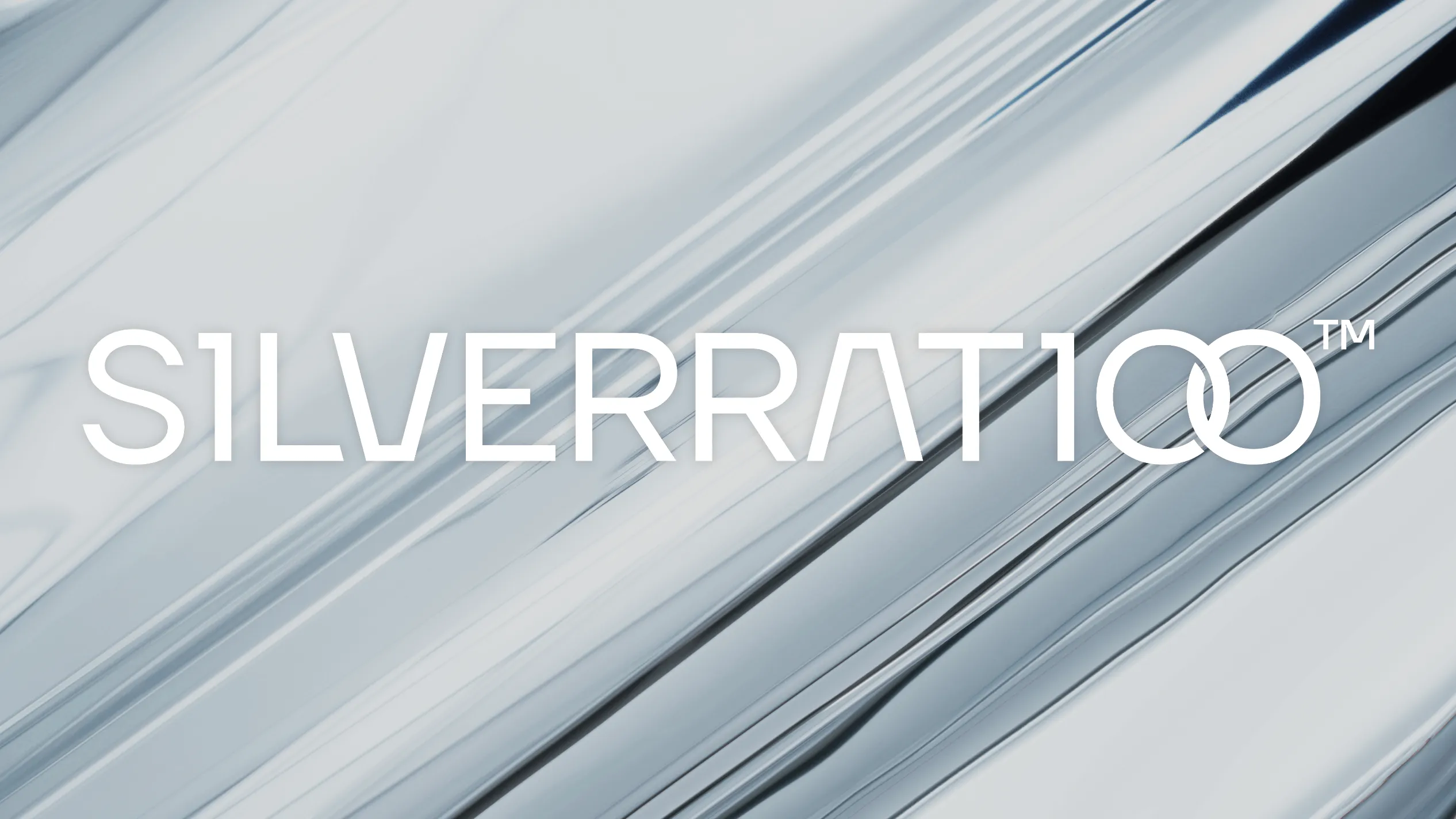
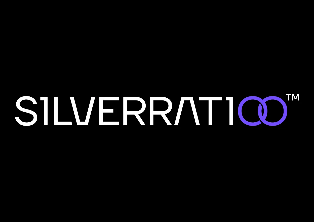
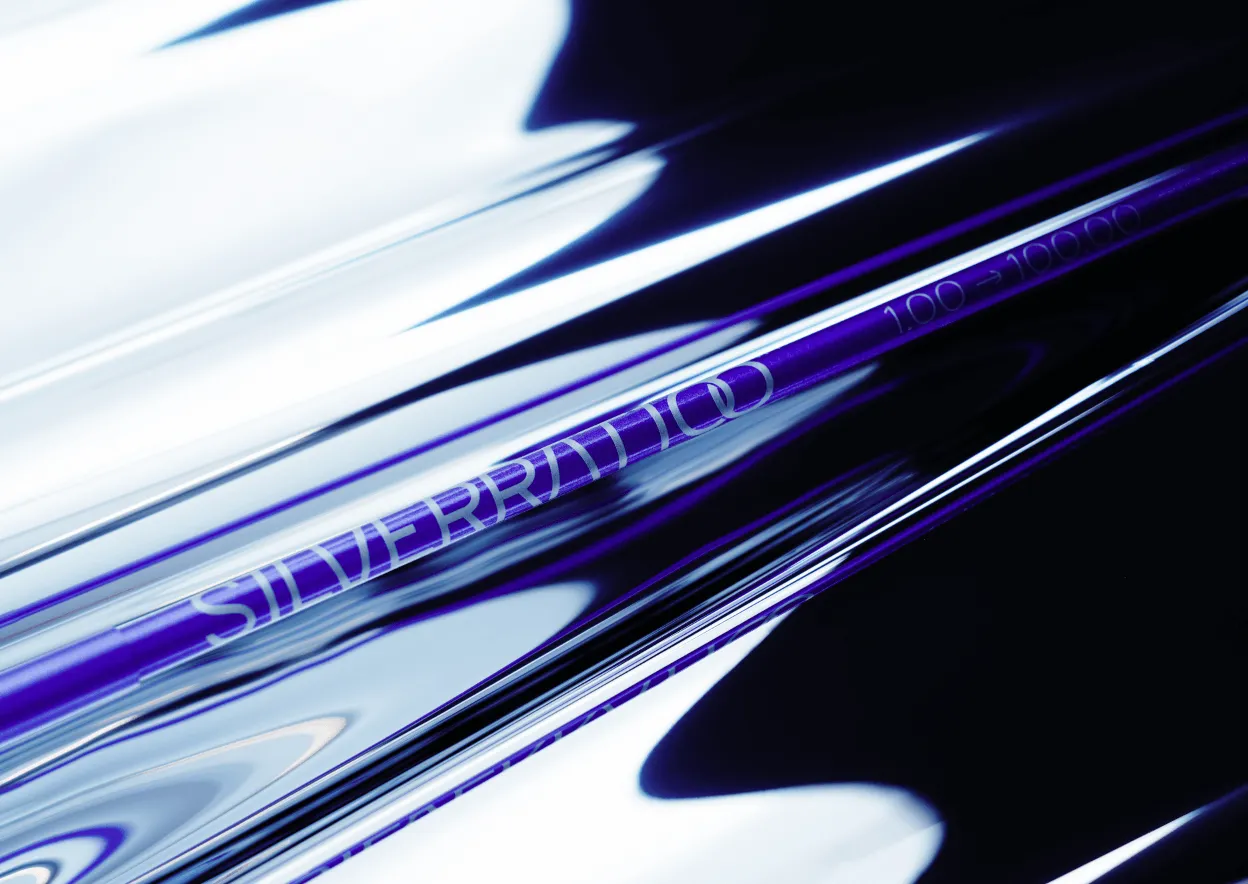
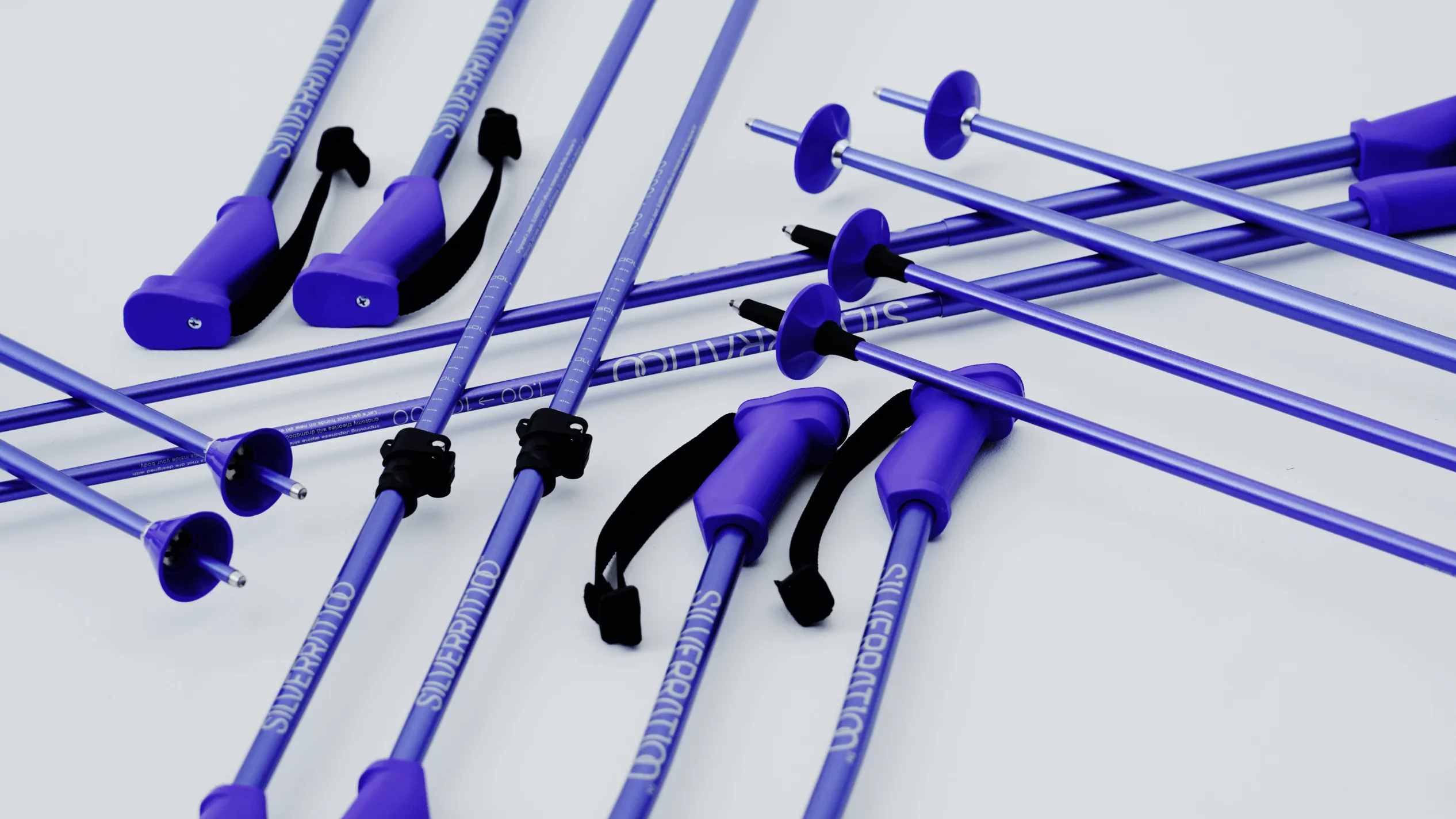
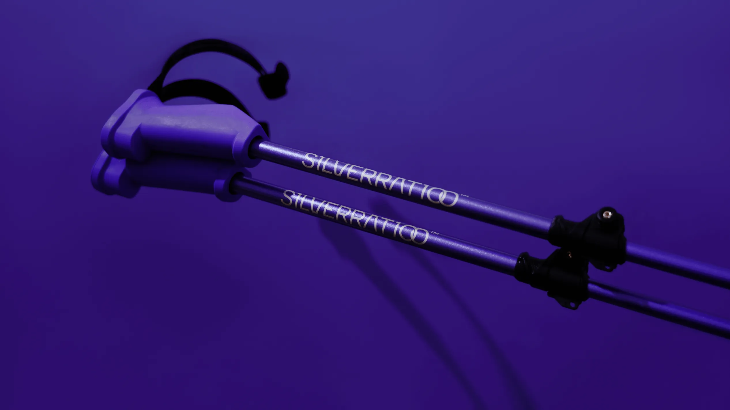
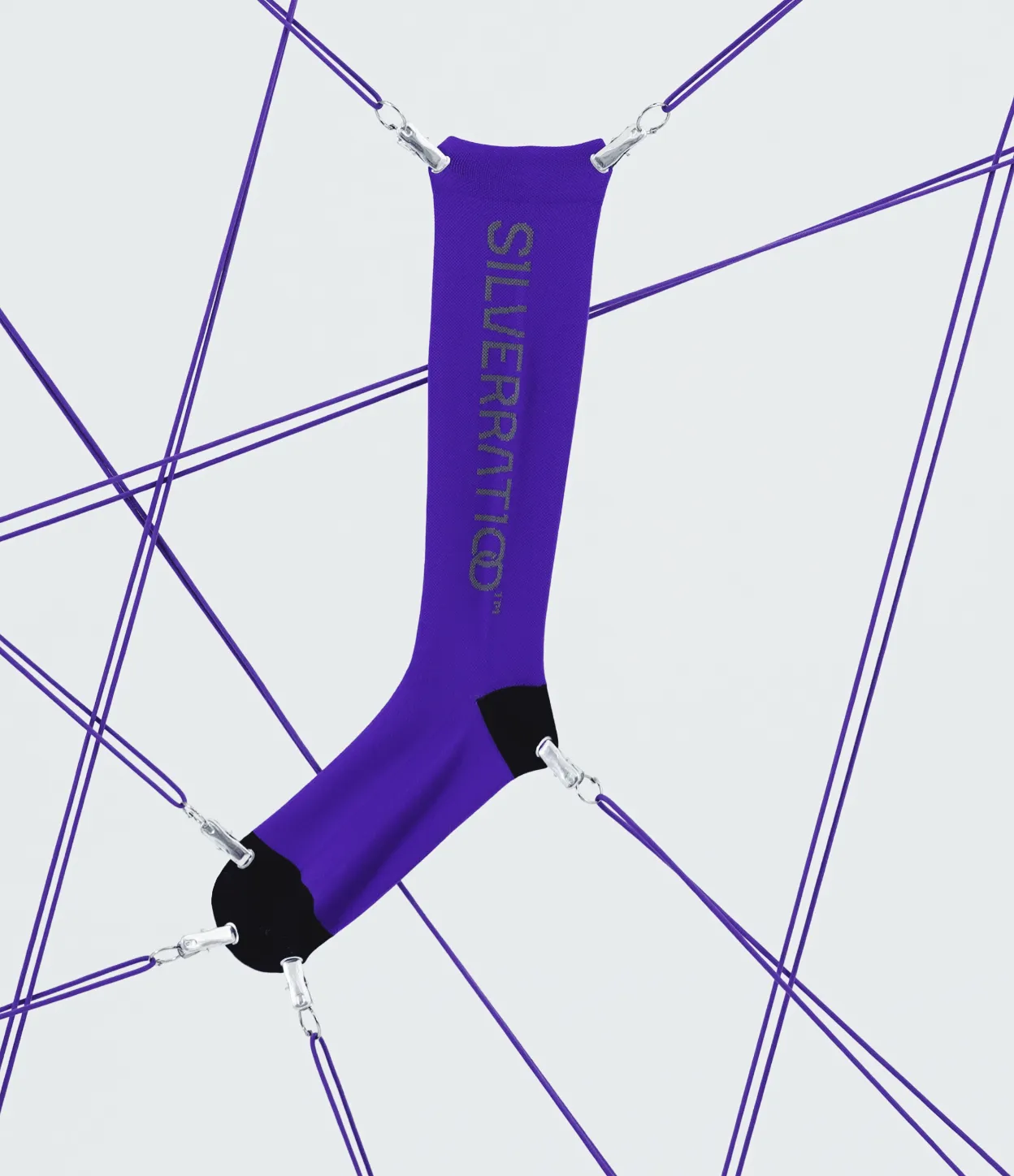
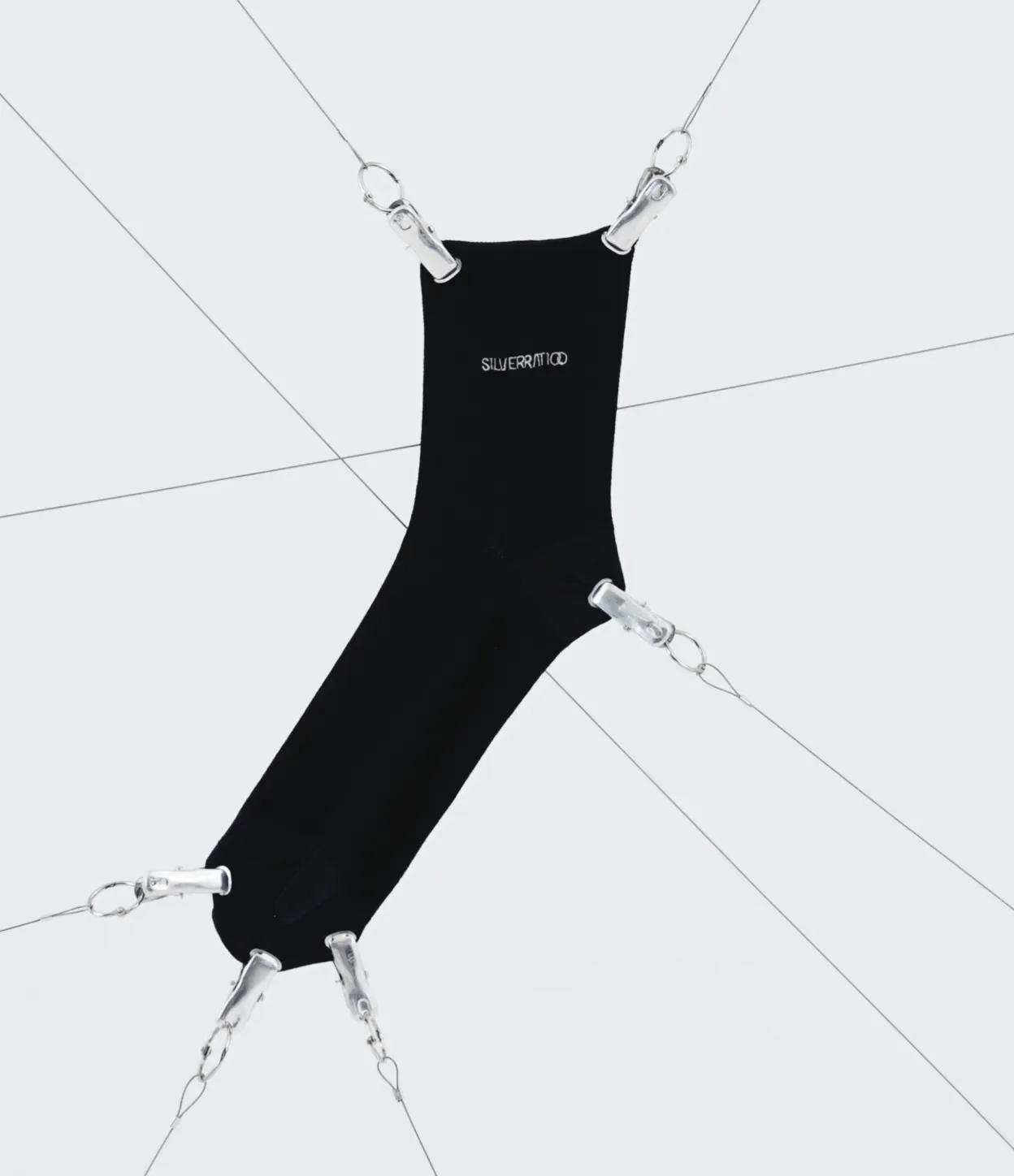
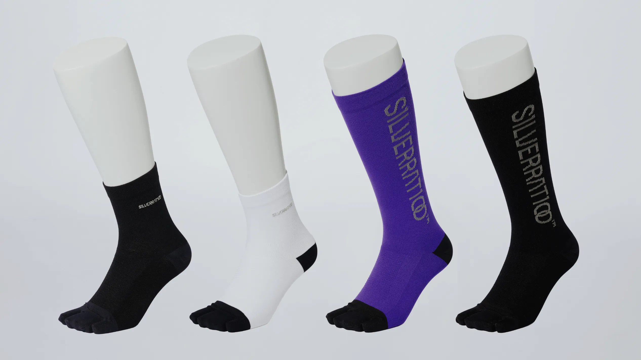
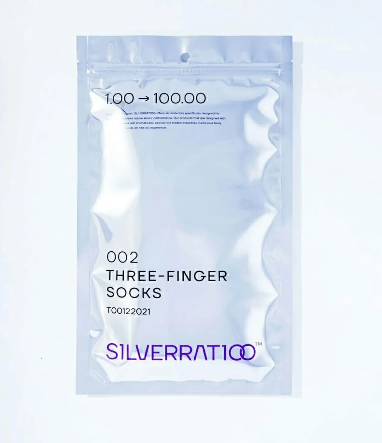
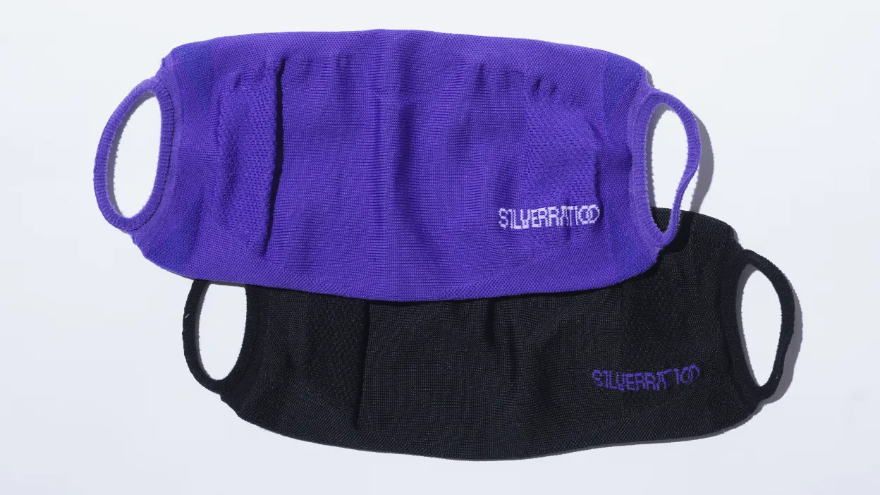
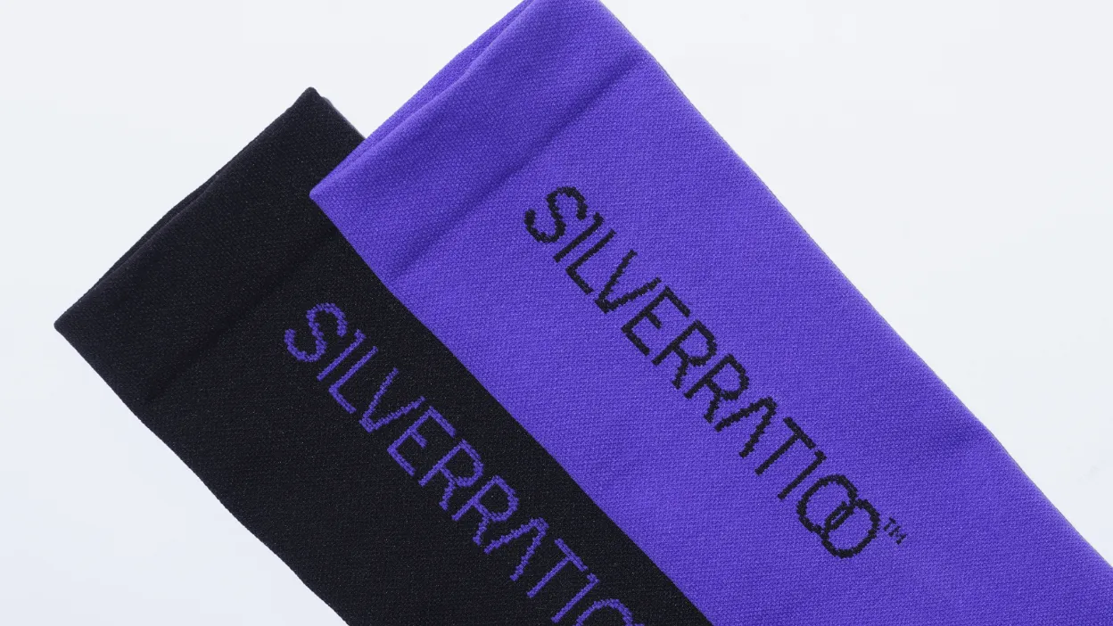
Branding project for "SILVERRATIOO," a Japanese ski material brand specifically designed for Japanese alpine skiers.
Working closely with the development team, who are committed to maximising skier performance by creating products tailored to Japanese physiology rather than existing Western standards, we developed the brand's vision, concept, and naming. Our work encompassed logo creation, visual system design, and packaging design.
日本人アルペンスキーヤーのために特化した、日本製のオリジナルスキーマテリアルブランド「SILVERRATIOO」のブランディングプロジェクト。欧米人の骨格に合わせた既製品ではなく、日本人の骨格を基準にプロダクトを開発し、スキーヤーのパフォーマンスを最大化することをミッションに掲げる開発チームメンバーと密に連携を行い、ブランドのビジョン・コンセプト・ネーミングから、ロゴ・ビジュアルシステム・パッケージデザインまで包括的なブランディングを行いました。